Building My First FinOps Dashboard
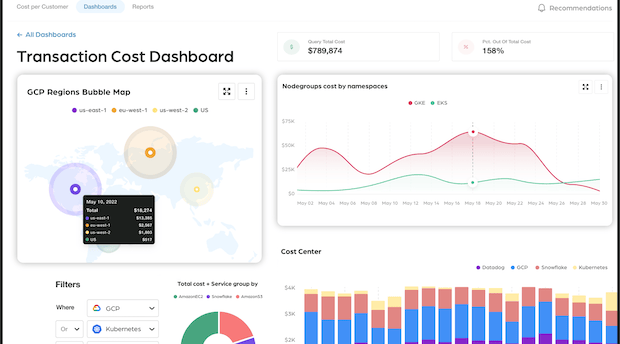
Descripción de la I built my first GCP cost dashboard and uncovered the chaos
MY
3/27/20242 min read


So there I was last Tuesday, staring at our GCP bill that somehow doubled since last month, when my manager walks by and casually drops: "Hey, we need a FinOps dashboard by Friday."
The Beginning of My FinOps Nightmare (Er... Journey)
Let me tell you what they don't mention in those fancy cloud certification courses - nobody warns you about the existential crisis you'll have trying to make sense of billing data across three cloud providers.
First thing I learned: our "tagging strategy" was basically "let the intern decide" for the past year. Cool, cool.
What I Actually Built (After 27 Coffee Cups)
1. Cost Visibility Panel (AKA "The Panic Button")
Created a real-time spend tracker that practically screams when we exceed budgets
Built departmental breakdowns that immediately started a blame game between Dev and QA
The service breakdown chart revealed we're spending more on idle GKE clusters than production (oops)
2. Resource Efficiency Section (Or "The Wall of Shame")
Found 7 Kubernetes clusters nobody would claim ownership of - they've been running for 9 months
Discovered our usage patterns spike every Thursday because someone scheduled automated pods to run infinitely
The best part? Our ML team was running n1-standard-32 nodes to host documentation websites
3. Optimization Insights (The "How We Keep Our Jobs" Tab)
Committed use discount recommendations showing we could save 34% if we planned anything longer than 24 hours ahead
Built an automated Slack alert that tags the engineer who spun up that 96-core GKE node pool "just to test something"
Created an anomaly detector that caught a rogue Kubernetes deployment that somehow kept scaling itself to 200 replicas
What Actually Happened When I Presented It
Marketing: "Can we make the graphs prettier?" Finance: "So you're saying we've been wasting HOW much?" Engineering: "I'm pretty sure those 18 Horizontal Pod Autoscalers are mission-critical" (Narrator: They weren't)
The real MVP feature? A simple button labeled "Who's responsible?" that maps namespace resources to teams. Suddenly everyone's very interested in optimization.
The Brutal Truth
Building this dashboard was like performing surgery while learning anatomy. I spent hours digging through BigQuery exports trying to understand why our Cloud Run services cost more than our entire infrastructure last year. But now that it's running, I can finally sleep at night knowing that random StatefulSet won't bankrupt us.
Next challenge: convincing people to actually USE the dashboard. Thinking of installing monitors in the bathroom stalls - they can't avoid it there!
Overview
Expert cloud guidance for financial operations transformation.
Services
Contact
+56 9 4020 5436
© 2025. All rights reserved.
